Designing trust through information architecture
A redesign of Etsy's iOS buyer experience — restructuring information so shoppers can find what matters faster and feel confident enough to buy.
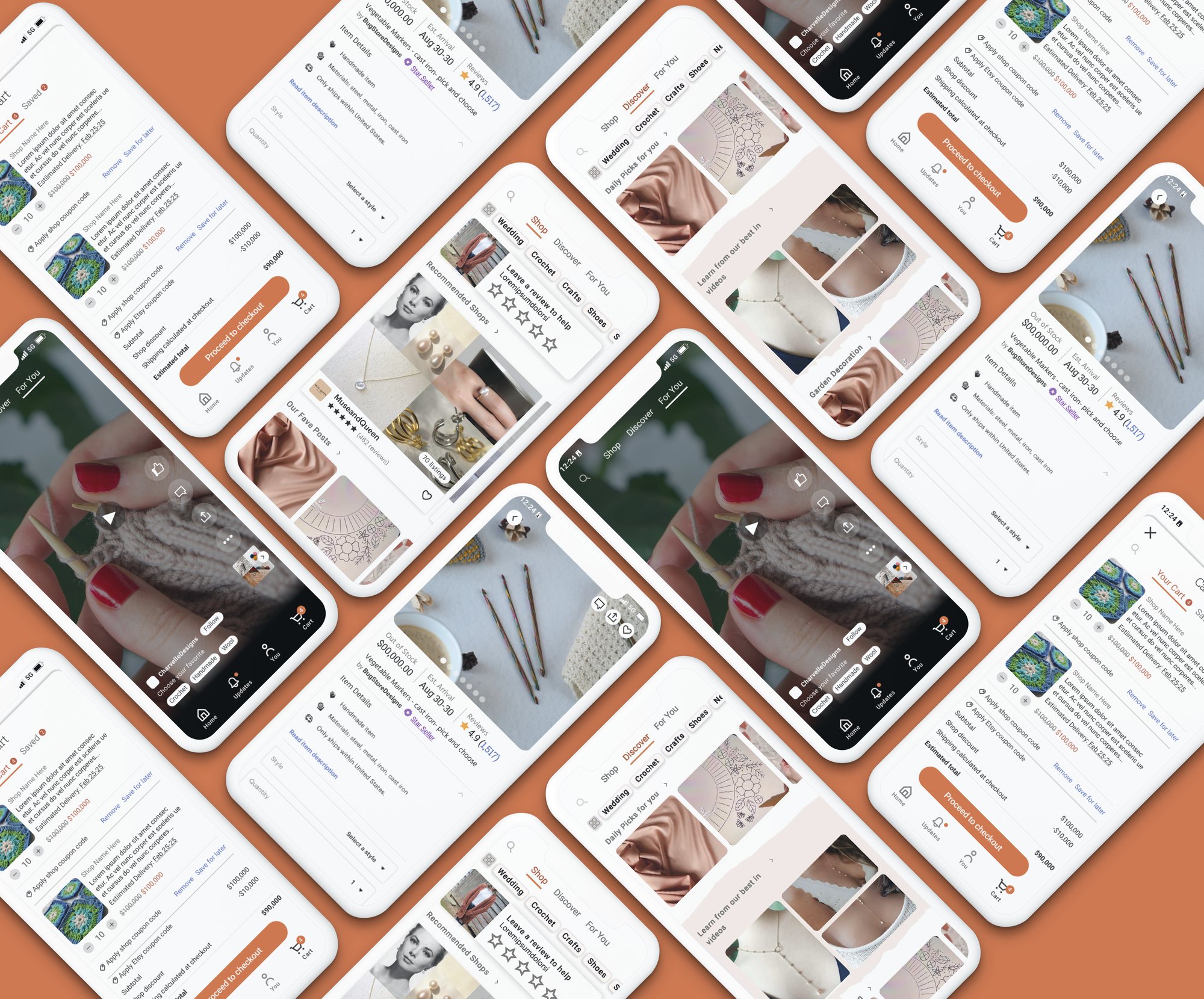
A redesign of Etsy's iOS buyer experience — restructuring information so shoppers can find what matters faster and feel confident enough to buy.
Etsy succeeds because shoppers value uniqueness, craftsmanship, and connection to independent creators. But user interviews revealed that the mobile experience often made those very qualities difficult to discover and trust.
Evaluating products required unnecessary effort — creating uncertainty during purchase decisions and increasing the likelihood of abandonment.
How might we improve Etsy's information architecture to help users find critical information faster and build confidence throughout the shopping experience?
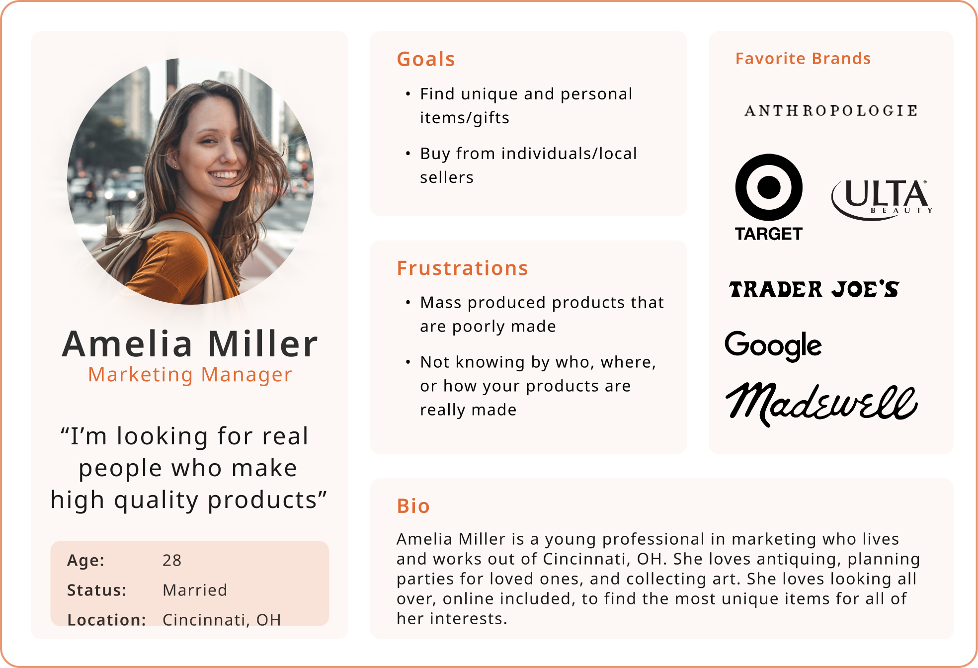
To understand where confidence broke down, I combined what shoppers said with what they actually did — surveying their priorities and pain points, then watching them move through the existing app.
Patterns surfaced quickly: people knew what they wanted, but the information they needed to feel sure rarely appeared when they needed it.
Trust, not discovery, became the primary design problem. Etsy users are willing to invest more time and money for unique products when they feel confident in what they're buying.
Surface pricing, shipping, and seller information earlier in the journey.
Reduce cognitive load by aligning navigation with real user behavior.
Help users start browsing with greater confidence and direction.
Create a consistent, accessible, iOS-native system while preserving Etsy's brand identity.
Related experiences were scattered across multiple destinations, forcing users to jump between sections to accomplish a single task. The redesign consolidated Shop, Explore, and For You into a unified Discover experience, and merged Messaging with Notifications to match how users actually communicate with sellers.
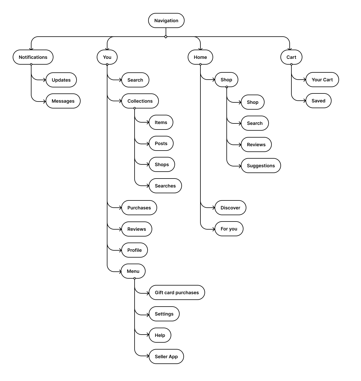
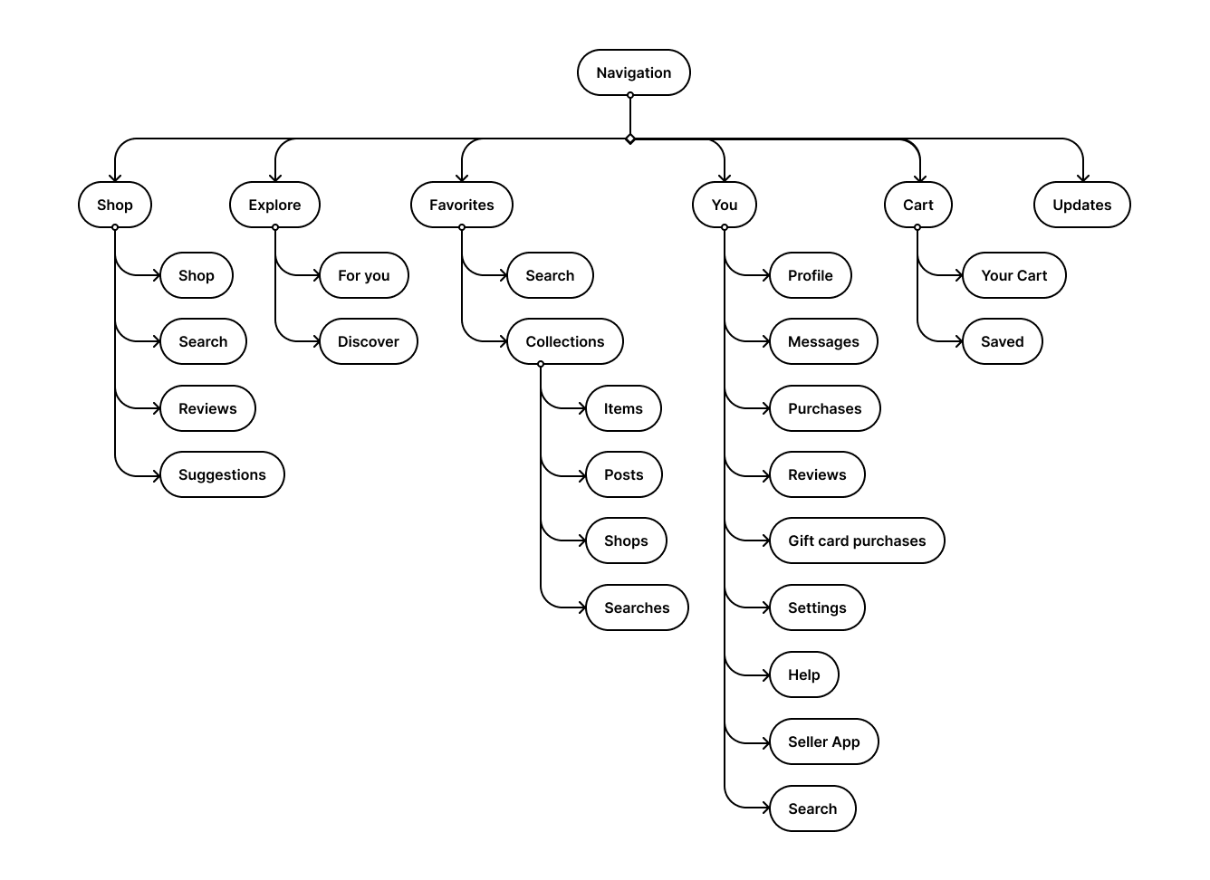
Many users knew what they wanted but struggled to figure out how to search for it. Keyword-driven suggestions were introduced directly in the search experience so everyone starts with direction.
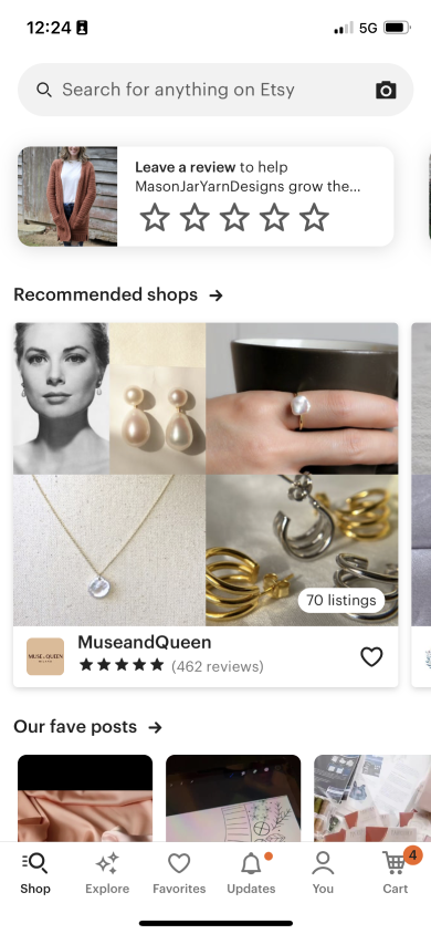
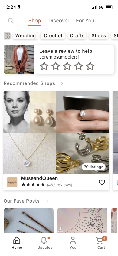
Shop and Explore were condensed into a single header, so every path to discovering new goods sits in one place the user can reach quickly.
→ Creates ease in discovering new contentKeyword pills sit directly under the new header, centering a discovery mindset — letting people search relevant content by behavior while surfacing new suggestions.
→ Replaces the empty search box with instant, behavior-driven starting pointsThe simplified bottom nav drops the Shop and Explore tabs, focusing it on actions tied directly to the user and giving that space a clearer, more personal purpose.
→ A calmer nav focused on the user, not competing destinations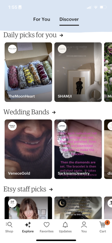
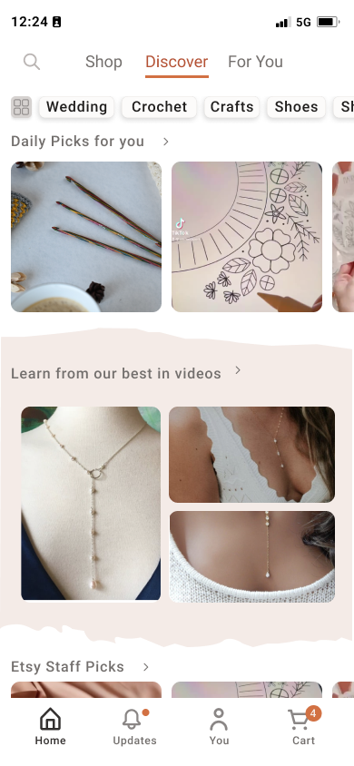
To support visual harmony between the home and discover pages, the blue header was repurposed as a mid-page feature section that draws the user down the page.
→ A unified experience that eases mental loadThe keyword pills carry through to this section too, nudging people to keep exploring the content.
→ Reinforces the user's desire to find new content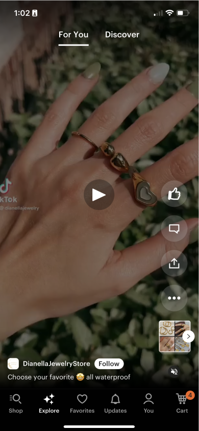
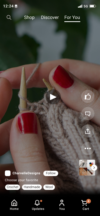
Adding the keywords here reinforces these terms and doubles as a quick search as people find content they enjoy.
→ Builds a consistent, learnable way to browse by interestResearch showed three factors consistently drove purchase confidence — price, shipping, and ratings. The product page was rebuilt to surface them first and give sellers real presence, so the information people needed appeared exactly when they were evaluating.
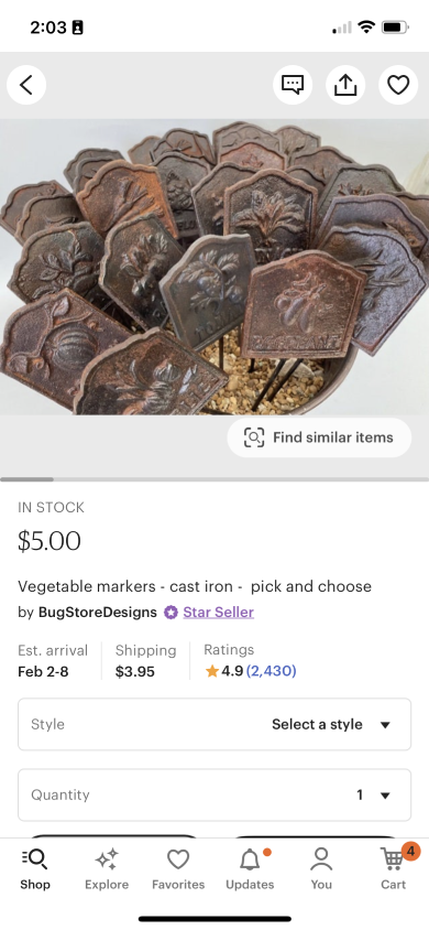
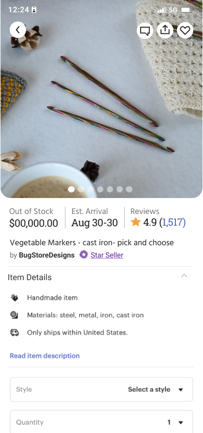
The #1 deciding factor now appears before any secondary content.
→ Faster evaluation, far less scrollingTimelines and cost sit alongside price instead of buried lower on the page.
→ Removes a top source of uncertaintySocial proof is visible at the exact moment of evaluation.
→ Builds confidence before the decisionEnhanced shop profiles, seller tags and specialties, and clearer creator information.
→ Reinforces buying from real people, not anonymous storefrontsOften, people use the cart to manage what they're interested in rather than what they intend to purchase. The page was rebuilt to put scannability and visuals at the forefront.

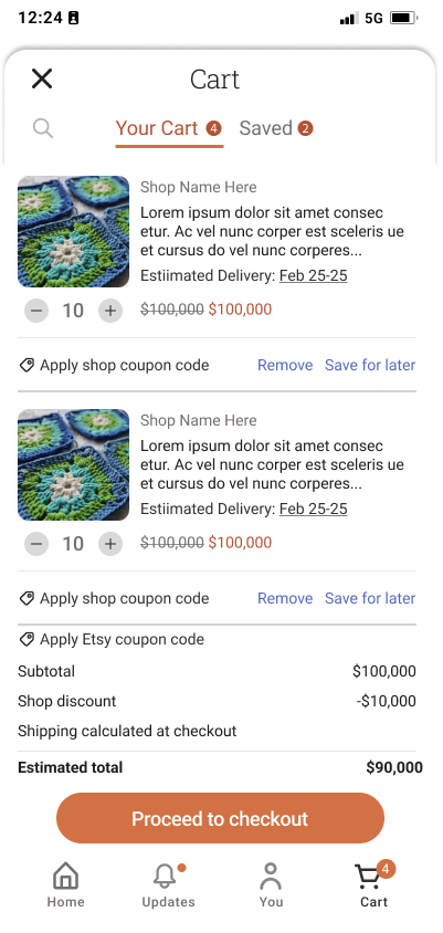
Larger product images help people remember and quickly see what they've added — and act as a visual reminder when they return to the cart after a while.
→ Quicker to recognize what's in the cart, even after time awayA larger area for quantity, per-item total, and shipping dates pulls forward the information people identified as key.
→ Surfaces the details that matter, cutting hesitation before checkoutOverall color on the checkout page was dialed up to make the experience more lively and inviting.
→ A more engaging path to purchaseThe visual system was updated to match current social media and e-commerce design trends, using styles that users already know from other platforms. Typography, color, and component design were refined to create a unified, accessible experience that feels natural on iOS and modern — while still keeping Etsy's warmth and character.
The visual system was modernized using interaction patterns familiar from contemporary mobile and e-commerce platforms. The goal wasn't to redesign Etsy's personality — but to create a more predictable, trustworthy environment for completing purchases.
After completing the redesign, users worked through updated task flows. Improving structure and hierarchy significantly reduced uncertainty throughout the shopping experience.
This feels familiar, like I understand how it's going to work.
It's easier to understand where I am.
I didn't even know this feature existed before.
Rather than introducing new functionality, the project focused on making existing information easier to discover, evaluate, and understand.
The deeper I explored the product, the more I realized this wasn't a navigation problem — it was a trust problem. Users weren't struggling because Etsy lacked features. They were struggling because the information they needed to make confident decisions wasn't appearing at the right moment.
Information architecture isn't just about organization. It's about helping people feel confident enough to take action.
The most impactful design decisions often aren't new features — they're the structural changes that make existing experiences easier to understand, trust, and enjoy.