Creating ease through consolidation and a purposeful design system
Unifying a fragmented digital landscape for one of the nation's largest Protestant churches.
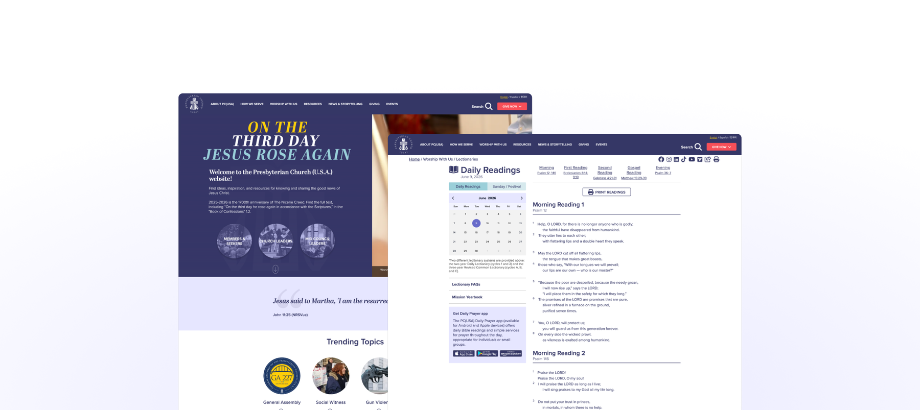
Unifying a fragmented digital landscape for one of the nation's largest Protestant churches.
Years of organic growth had scattered content across overlapping sites with no shared structure. Members couldn't find what they needed, and the experience felt more like a source of frustration than a tool for engagement.
We consolidated a fragmented ecosystem into a single, accessible platform built on a purposeful design system — clarifying navigation, modernizing the interface, and re-establishing the site as a meaningful, welcoming resource.
The organization needed its digital presence to unify experiences, provide reliable access to resources, and re-establish the site as a meaningful tool for engagement rather than a source of frustration.
Discovery research spanned 290 survey respondents and 14 stakeholder interviews to ground the redesign in real needs. Patterns emerged fast: people knew what they wanted but couldn't find it.
We mapped frustrations to concrete tasks, then prioritized the journeys that mattered most to members and leaders.
"It is very difficult to find anything on the website. I get frustrated, and I know what I'm looking for. I can't imagine what people in the pews think when they go to our websites."— Mid-council member & leader
We developed a simple brand value framework to keep design decisions aligned. It translated the organization's character into rational and emotional guardrails the whole team could design against.
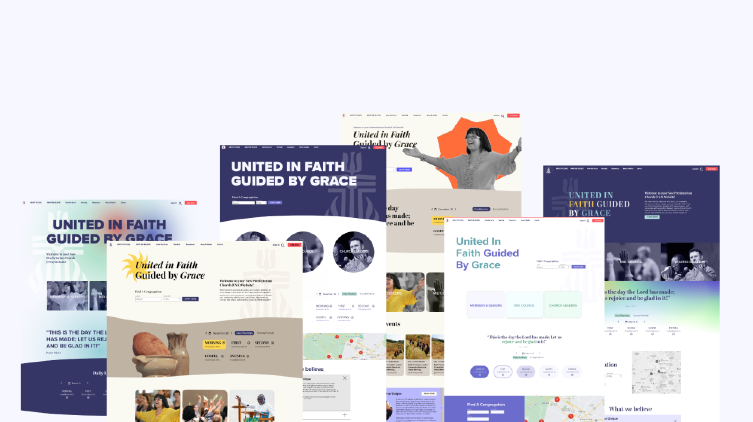
"The website should have a clean, uncluttered look. Visitors should come away feeling they easily found what they were looking for — that visiting was a rewarding experience and they want to come back again and again."— Project stakeholder survey response
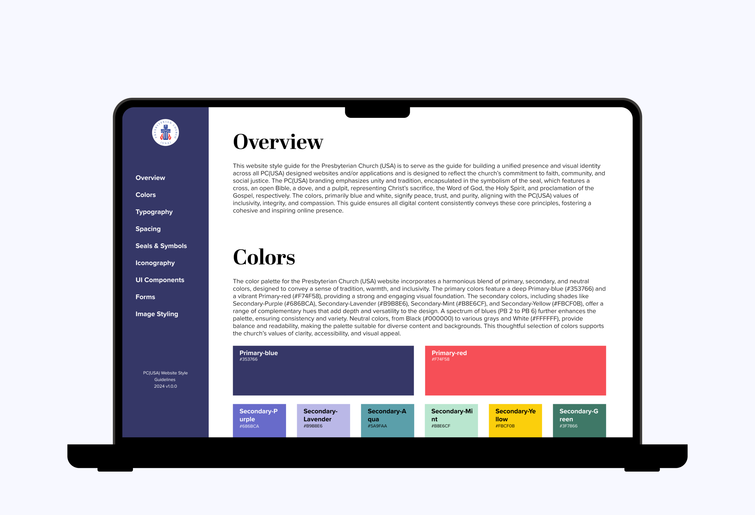
We used WCAG criteria as guardrails to bound the design and resolve ambiguity. Accessibility wasn't a final pass — it defined color, type, spacing, contrast, and interaction patterns from the start.
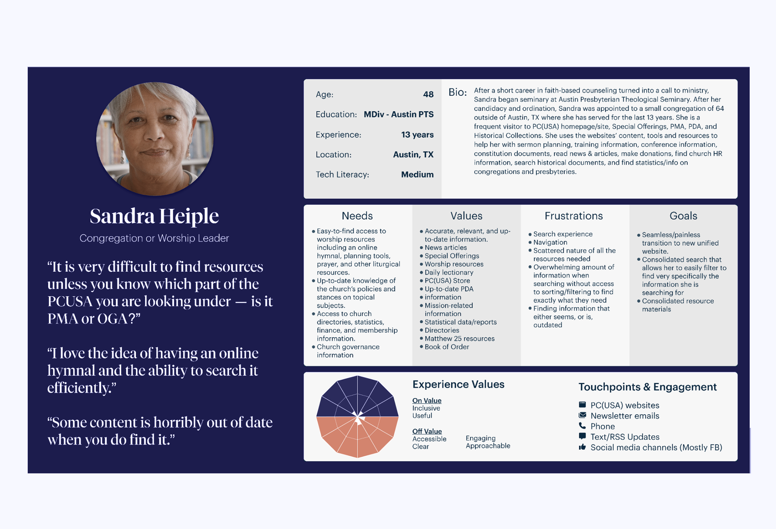
We built personas grounded in the research and used them as filters for every feature: would this serve Sandra trying to find a resource on her phone between meetings? If not, it didn't ship.
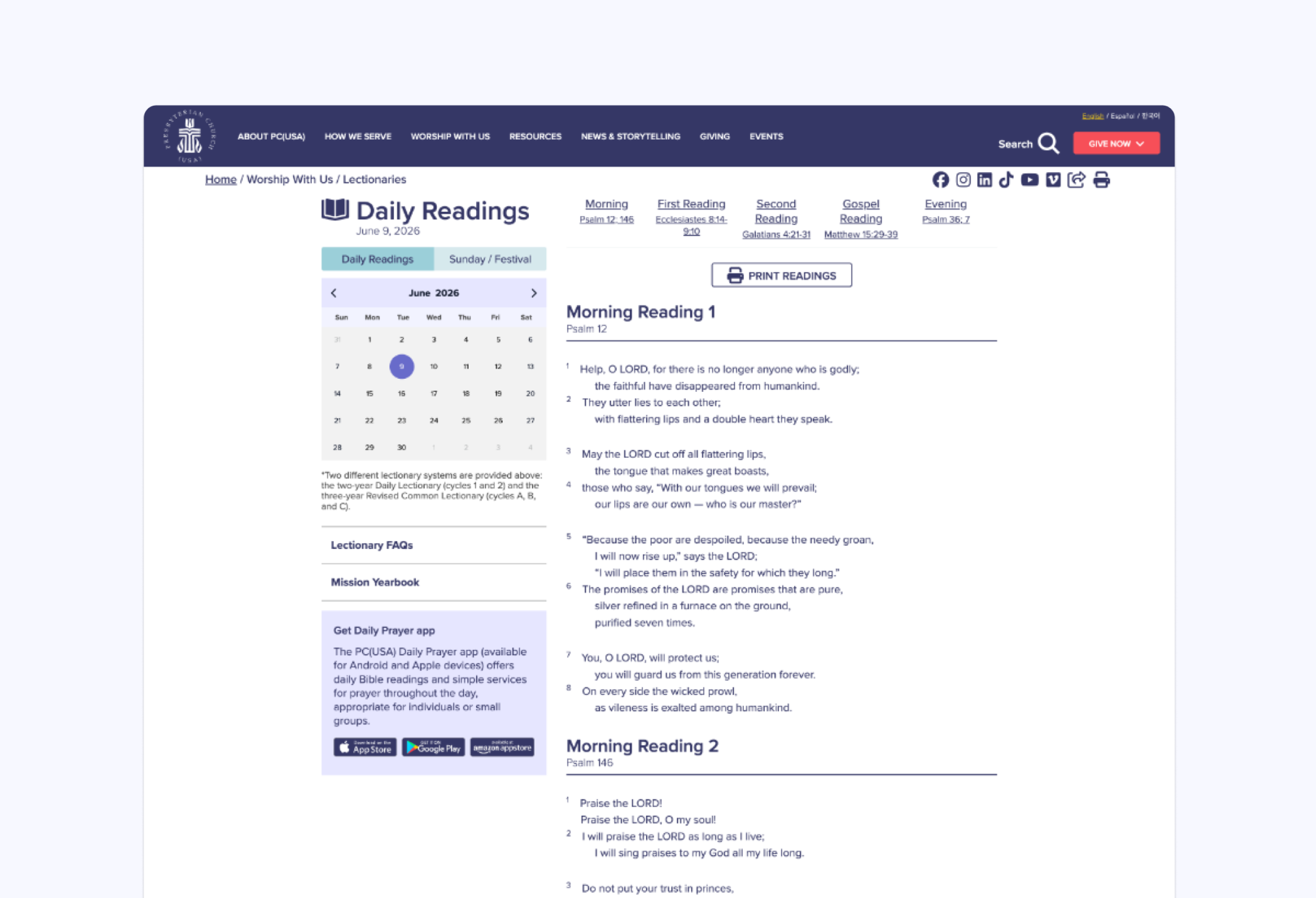
The lectionary is the single most-visited page — and the most navigation-heavy. We rebuilt it around a clear daily-reading hierarchy so the highest-traffic moment became the simplest one.
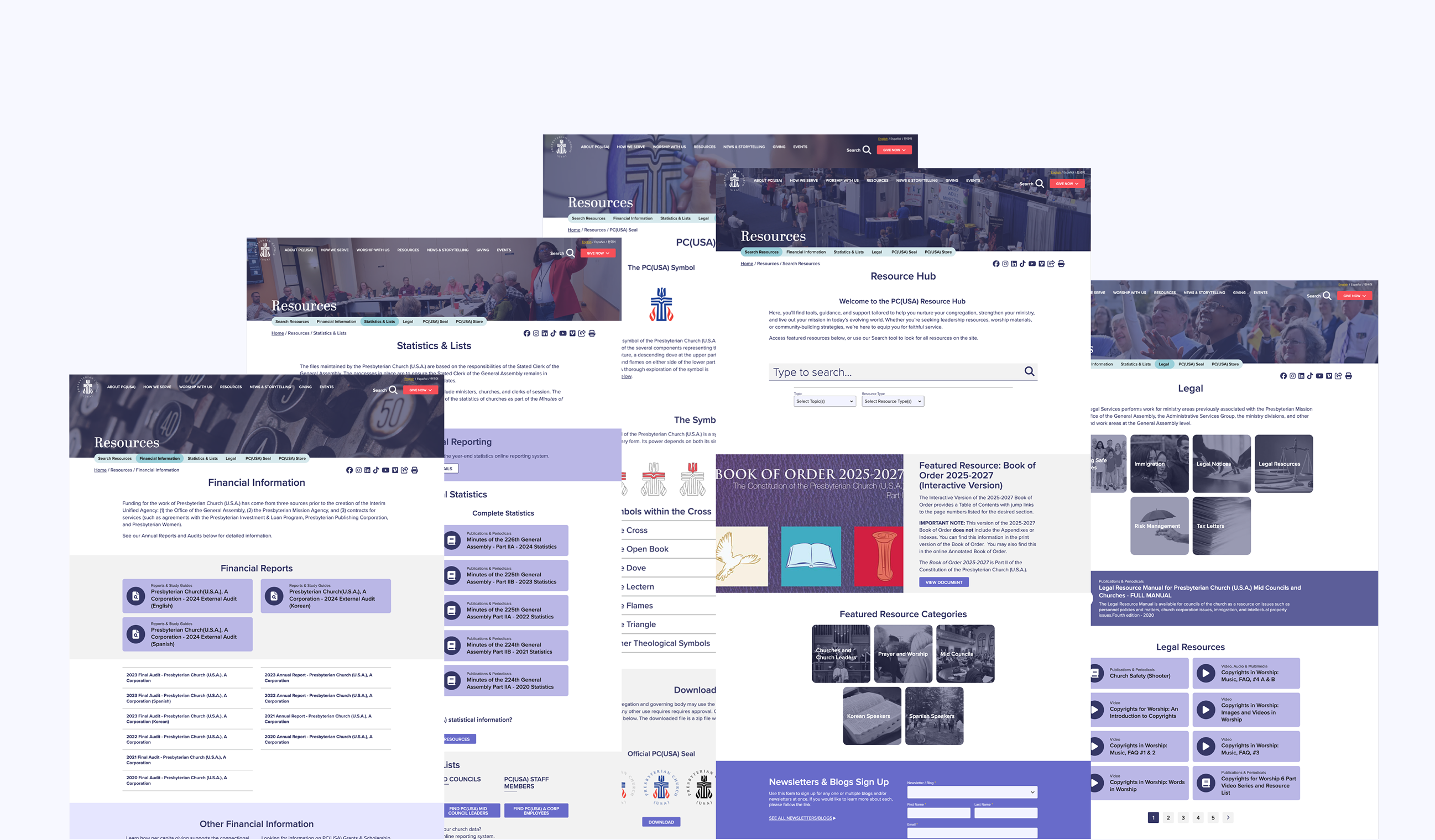
We redesigned the resources section with a smart, consistent layout and unified search so the largest, densest part of the site became scannable. Filtering and clear taxonomy replaced guesswork.
Search now spans the whole ecosystem with type-ahead, scoped results, and forgiving queries — so people land on what they need whether they know the exact term or not.
We reframed the navigation around real intent, not internal org structure — surfacing the most common journeys and giving every audience a clear, predictable path to what they came for.
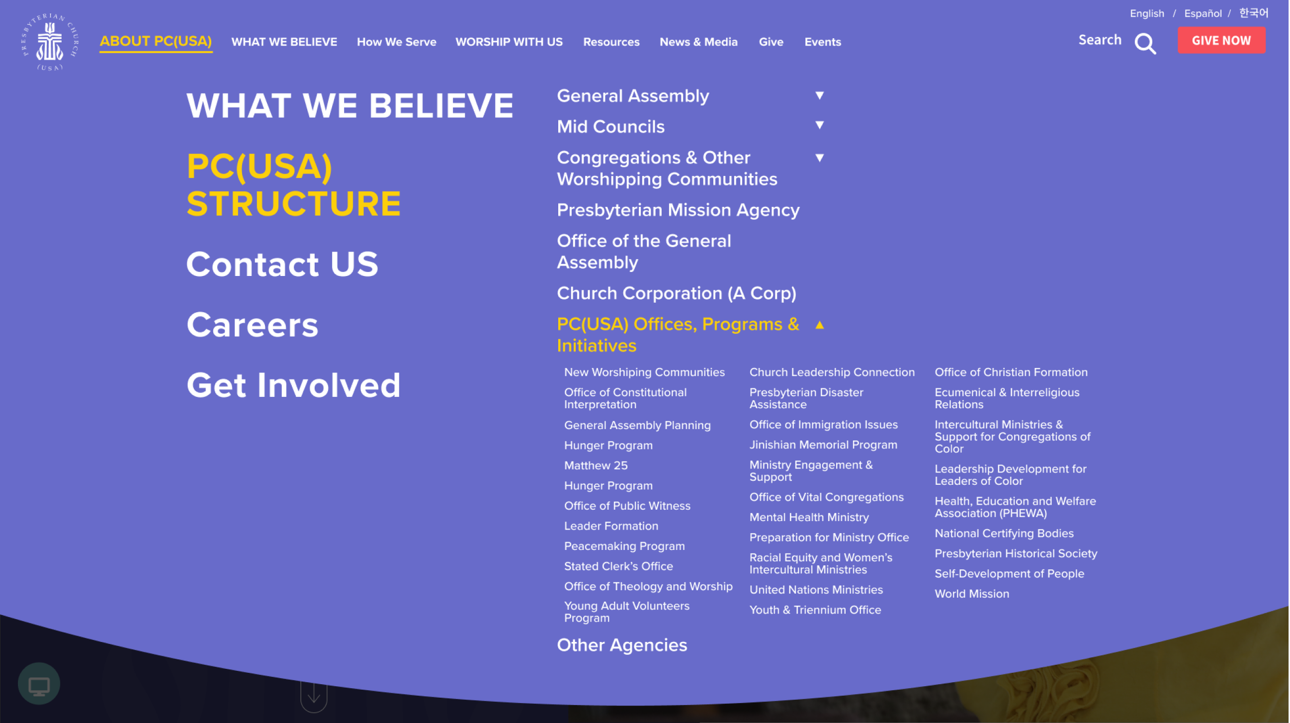
The redesigned information architecture earned a Web Excellence Award, recognized for navigation and search that finally matched how people actually look for things.
Built-in multilingual support made inclusion structural rather than an afterthought — broadening access for a national, multigenerational community.
A single, consistent platform replaced a tangle of disconnected sites, giving every visitor one coherent, trustworthy place to land.
Large projects live or die on alignment. Shared values, personas, and a living design system kept dozens of stakeholders pointed in the same direction — and made every tradeoff a conversation about users, not opinions.
We built the design system while shipping, in parallel with development. Working iteratively and documenting decisions as we went let us move fast without losing the consistency the system was meant to protect.